iPhone Duo audit

Ran 2026-10-30 in Playwright WebKit 27.2 at the viewports WebKit published for Safari 27.1 (poses.json, collected 2026-10-27). This is emulation: the right engine family and sizes, not Safari 27.1 itself. Confirm in Safari before calling it done (duo-simulator.sh, or a device). Pages are measured with reduced motion on, so animations are stopped where the page's reduced-motion styles leave them.

Safari pass: Skipped: this sample was made on a Mac without Xcode 27.1, so the iPhone Duo simulator wasn't available. The audit stands on its own.

Reply go and your agent makes 8 safe fixes and 3 of its picks, which clear 15 items.

2 need your answer first:

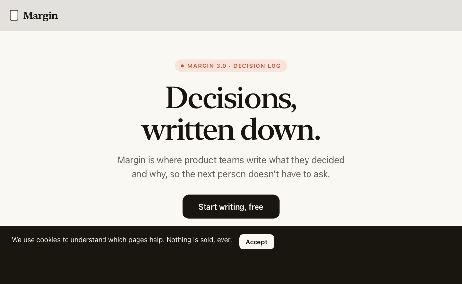
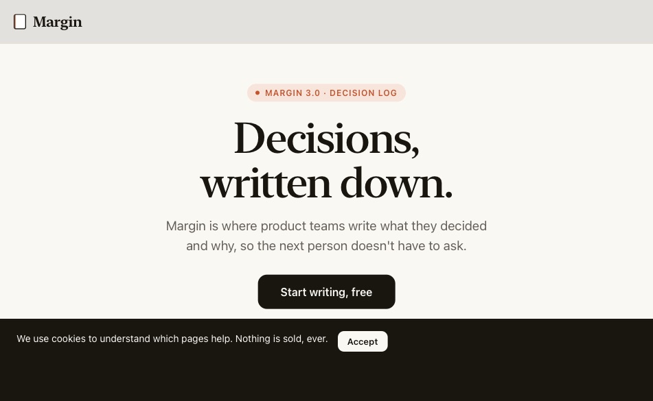
  1. #1 "Start writing, free" is centred alone, so on the open screen it sits on the crease. Add a second button, such as "Take the tour", so the gap between them lands on the crease? Or keep one button and move it to the left on wide screens?
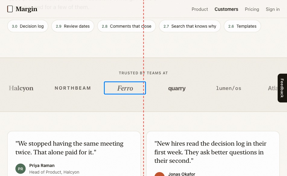
  2. #15 With reduced motion on, the customer logos stop with Ferro on the crease. Leave it, or show reduced-motion visitors a static grid of logos?

2 items stay as they are, each with its reason.

Answer by number, like "#3: keep four links", or change a level the same way.

http://localhost:4173/broken.html

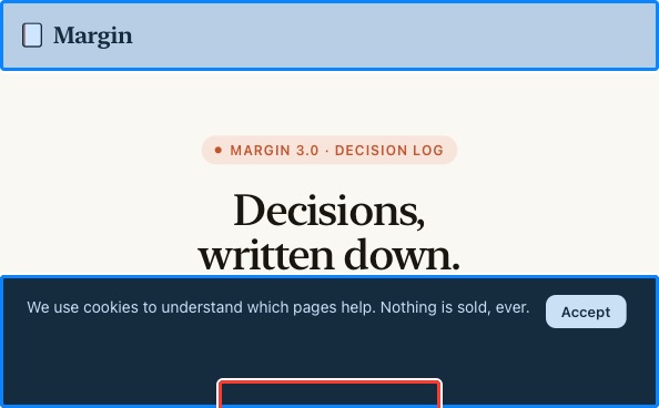
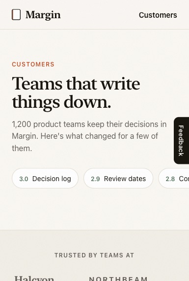
Closed
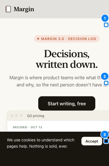
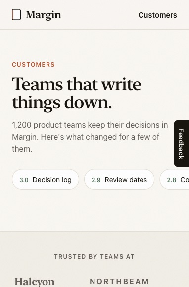
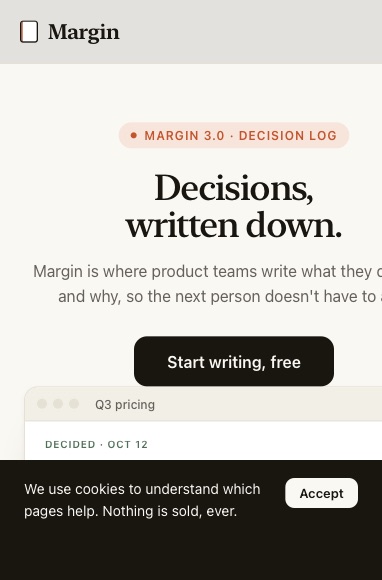
Closed 382 × 580
scrolls sideways · bars 32%
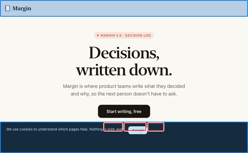
Closed, wide
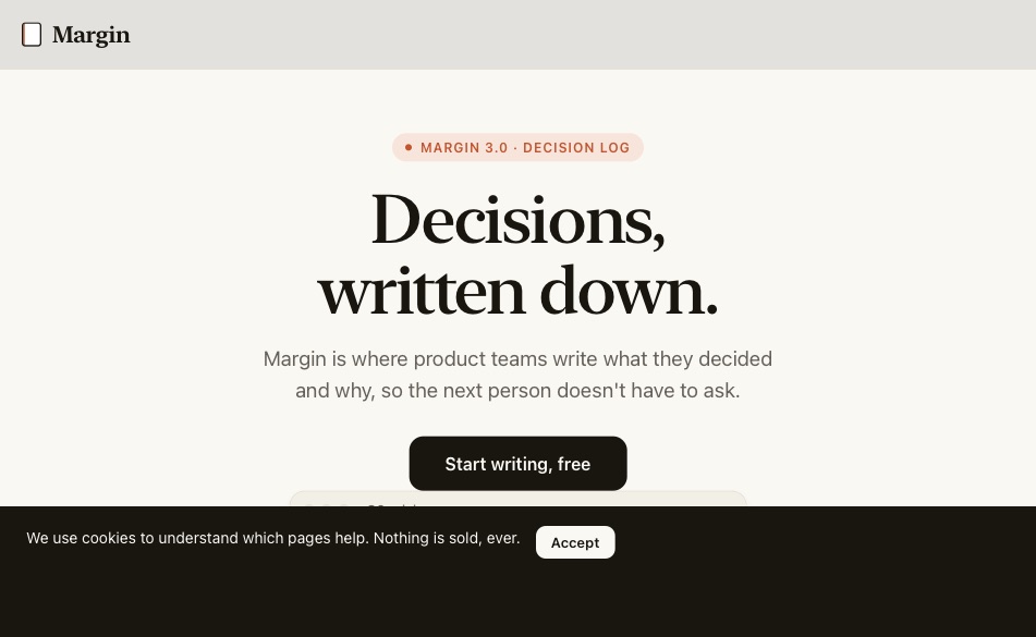
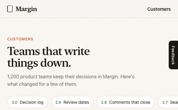
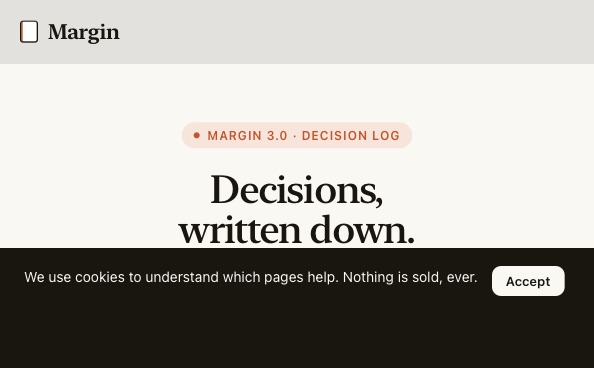
Closed, wide 594 × 368
no sideways scroll · bars 50%
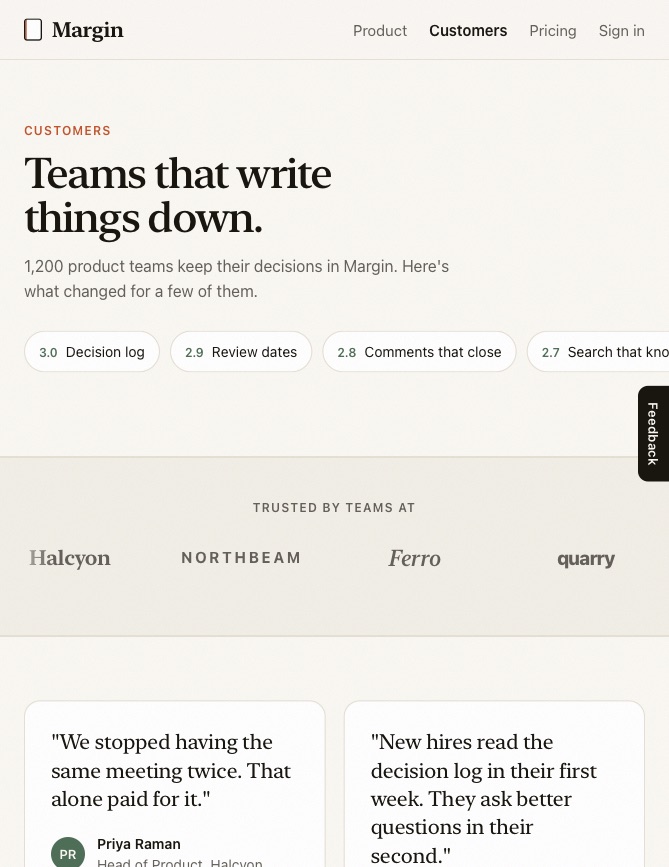
Open
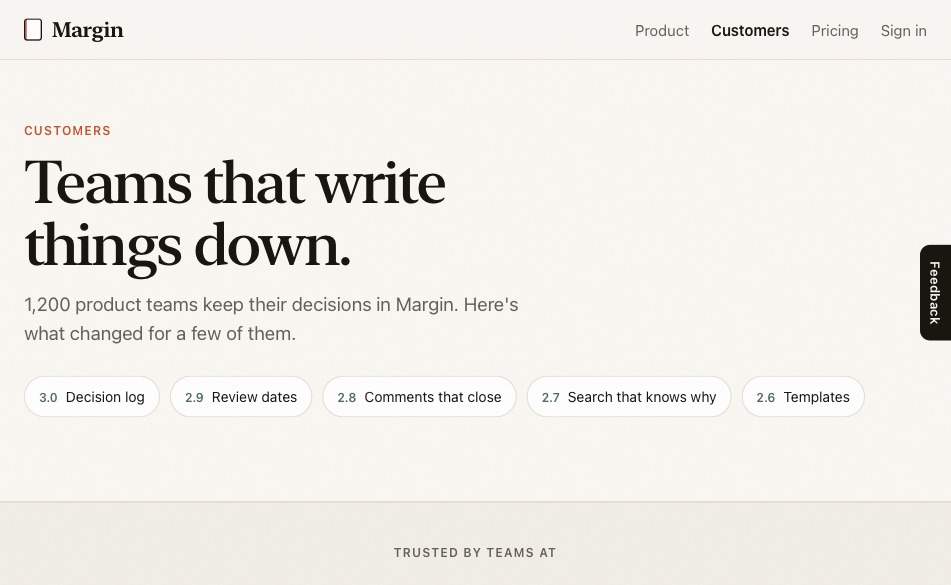
Open 951 × 585
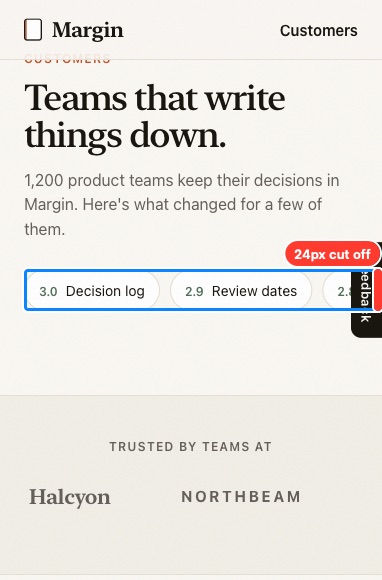
no sideways scroll · 1 on the crease · bars 31%
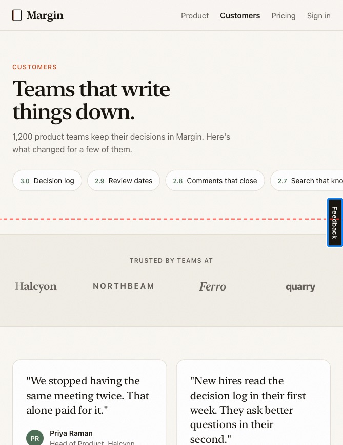
Open, tall
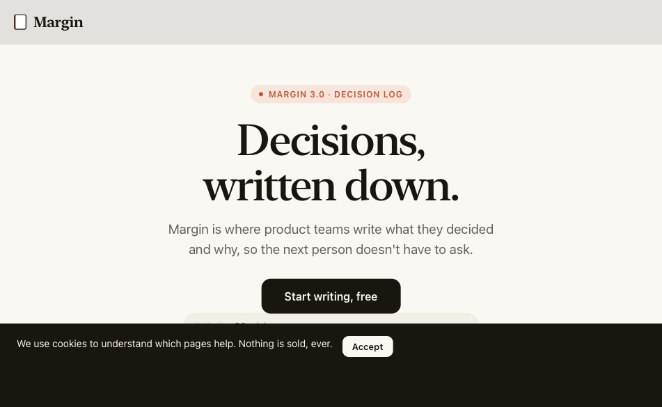
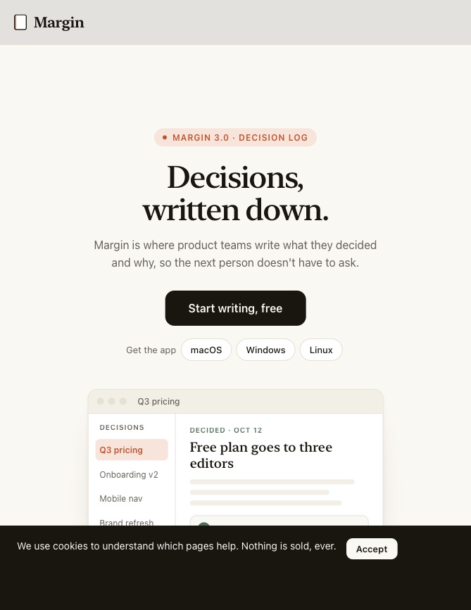
Open, tall 669 × 867
no sideways scroll · bars 21%
Split View
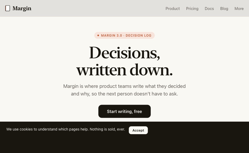
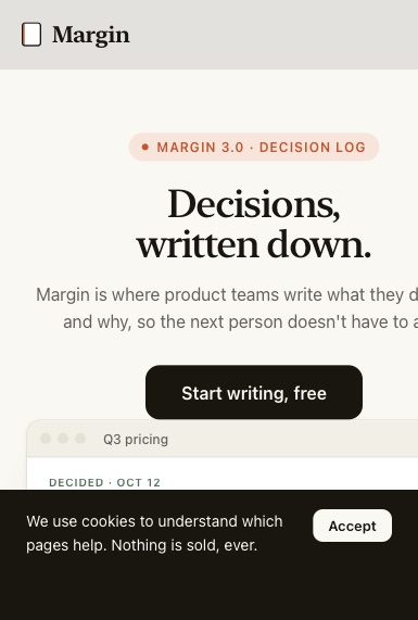
Split View 385 × 571
scrolls sideways · bars 32%

Needs you 1Changes content, links or product behaviour, or might be deliberate. Nothing happens until you answer.

Controls on the crease
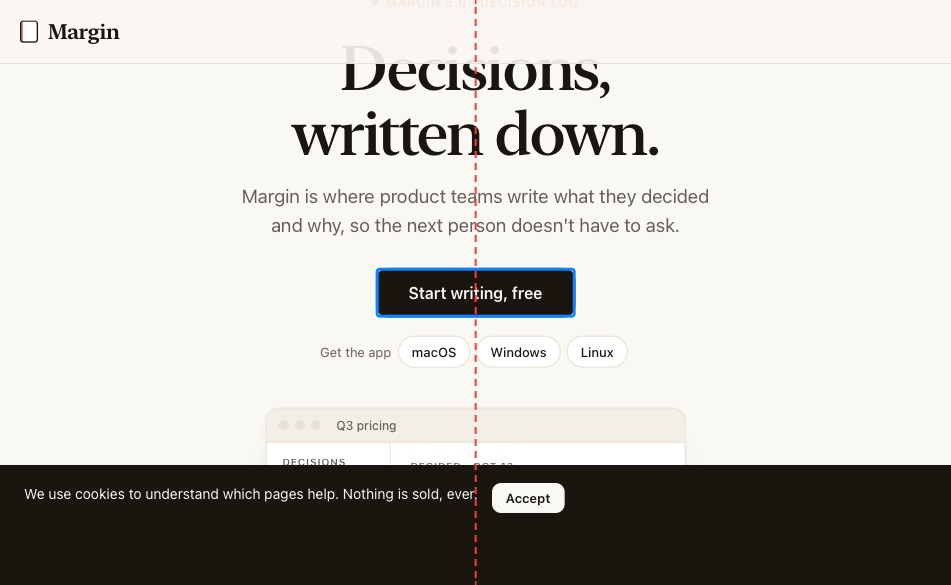
Open · red line: the crease
1

Control on the crease

Needs youTo fixOpen

a.lone "Start writing, free"

  • 200px wide, spans x 376–576; the crease is at x = 475.5
Your call

"Start writing, free" is centred alone, so on the open screen it sits on the crease. Add a second button, such as "Take the tour", so the gap between them lands on the crease? Or keep one button and move it to the left on wide screens?

Options

A pair of equal buttons is the smaller change and reads better at every width, but it adds a call to action. That's a content decision, so it's yours.

test/broken.html:114

On the open screen the fold runs down the middle. Partly folded, a small control there is hard to tap. Apple: keep controls out of the fold.

crease:a-lone:start-writing-free
My pick 4More than one reasonable layout. The agent picks one you can easily undo, and lists it after.

Fixed bars take too much of the screen
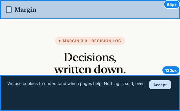
Closed, wide
2

Fixed bars take too much of the screen

My pickTo fixClosed, wide
  • 50% of the 368px height
  • header.wrap 64px tall at y 0
  • div.banner 120px tall at y 248
The fix

Make the cookie notice a floating card capped at 520px. On screens under 420px tall, let it join the page instead of floating. The other option is keeping the full-width bar at one line tall.

test/broken.html:92

Fixed bars take this much of the screen, on top of Safari's own bars.

bars:closed-landscape

Fixed bars cover controls
Closed, wide
3

Fixed bar covers controls

My pickTo fixClosed, wideCleared by #2
  • a.lone "Start writing, free" under div.banner
The fix

Cleared by the cookie-notice change: on the short screen it no longer floats over the hero.

A fixed bar sits over these controls at load, so they can't be tapped.

covered:closed-landscape

Fixed bars cover controls
Open
4

Fixed bar covers controls

My pickTo fixOpenCleared by #2
  • button "macOS" under div.banner
  • button "Windows" under div.banner
  • button "Linux" under div.banner
The fix

Cleared by the cookie-notice change: a 520px card at the bottom no longer reaches the download buttons.

A fixed bar sits over these controls at load, so they can't be tapped.

covered:open-landscape

Grid with a column on the crease
Open · red line: the crease
5

Grid with a column on the crease

My pickTo checkOpen

div.grid

  • 3 equal columns; the middle one sits on the crease
The fix

1 column, then 2 from 600px. Three cards in two columns leave one alone, so the third card spans both columns. The other option is adding a fourth card, which would be a content change.

test/broken.html:77

An odd number of equal columns puts the middle one on the fold. Apple prefers an even number.

grid:div-grid

Safe fix 9One reasonable answer, a small change, holds at every width.

Scrolls sideways
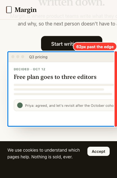
Closed
6

Scrolls sideways

Safe fixTo fixClosedSplit View

figure.app-shot

  • reaches x = 444, 62px past the 382 wide edge (420px wide)
  • Split View: reaches x = 444, 59px past the 385 wide edge (420px wide)
The fix

The app preview has a fixed width: 420px. Make it width: 100%; max-width: 640px, so it fits the closed screen and stays capped on wide ones.

test/broken.html:56

The page scrolls sideways at this size. Safari shrinks such a page to fit, so everything gets smaller.

sideways:figure-app-shot

Fresh load at Open
Fresh load at Open
Loaded closed, then opened
7

Layout stays closed after opening

Safe fixTo fixOpen
  • 0 controls moved, 7 missing, 3 extra; page height differs by 5%
The fix

The width is read once at load, so the app preview's sidebar stays hidden after the device opens. Replace the script with a media query: hide the sidebar under 600px in CSS.

test/broken.html:96, test/broken.html:159

Opening the device resizes the page without a reload. This layout kept something from the closed size.

resize

screen.width at the open size
screen.width at the closed size
8

Layout reads screen.width

Safe fixTo fixOpenCleared by #7
  • 4 controls moved, 3 missing, 3 extra; page height differs by 5%
  • e.g. BUTTON:Q3 pricing, BUTTON:Onboarding v2, BUTTON:Mobile nav, BUTTON:Brand refresh
The fix

Same script: it hides the downloads when screen.width is under 600px, and on the simulator that stays at the closed value after opening. Hide them with a width media query instead.

test/broken.html:98, test/broken.html:162

screen.width keeps the closed value after opening. Layout read from it is wrong when open.

screen

iPhone user agent
iPhone user agent
Mac user agent
Mac user agent
9

Layout changes with the user agent

Safe fixTo checkOpenCleared by #7
  • 0 controls moved, 0 missing, 5 extra; page height differs by 0%
The fix

Same script: it hides the nav for any user agent that says "iPhone", including the 951px open screen. Collapse the nav with a width media query instead.

test/broken.html:97, test/broken.html:161

iPhone Duo says "iPhone" at every size. The layout changes with the user agent.

ua

Page background doesn't match the page at the edge
Closed
10

Background colour doesn't match the edge

Safe fixTo checkClosed
  • page background rgb(17, 17, 17); at the right edge: rgb(250, 248, 243), rgb(250, 248, 243), rgb(24, 22, 15)
page backgroundedge 1edge 2edge 3
The fix

body is #111 behind a light page, so Safari would paint a dark column beside it on the closed screen. Give html and body the page's own colour, var(--paper).

test/broken.html:22

On the closed screen Safari paints the page's background colour behind its side column. It doesn't match what's at the page's edge.

background

CSS rule
11

Height in vh

Safe fixTo check

.hero

  • sets the element's height at: Open, tall
The fix

min-height: 100vh sets the hero's height on Open, tall, where Safari's 100vh is 35px taller than what's visible. Add min-height: 100svh after it, keeping 100vh as the fallback.

test/broken.html:44

In Safari, 100vh is the height with its bars hidden, 35 to 38px more than what's visible. It only matters where the rule sets the height.

vh:hero

CSS rule
12

Shown on hover only

Safe fixTo check

.menu:hover > .sub

The fix

Open "More" on tap: :focus-within and an .is-open class toggled on click, closing on Escape. Keep hover only inside @media (hover: hover) and (pointer: fine).

test/broken.html:38

Every iPhone Duo pose is touch. Content that only opens on hover can't be reached.

hover:menu-hover-sub

CSS rule
13

One inset for both sides

Safe fixTo check

.wrap

The fix

Set each side from its own inset: padding-left: max(20px, env(safe-area-inset-left)) and the same for the right.

test/broken.html:25

The closed screen's two side insets differ. One value for both sides is wrong on one of them.

insets:wrap

CSS rule
14

Header padded by the top inset

Safe fixTo check

header

The fix

Remove padding-top: env(safe-area-inset-top) from the header. The page doesn't draw under the status bar, and in-app browsers would turn this into a dead strip.

test/broken.html:29

In-app browsers report a large top inset under their own toolbar, which turns this padding into a dead strip.

top-inset:header

http://localhost:4173/edge.html

Closed
Closed 382 × 580
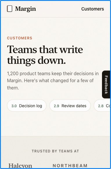
clipped at the edge · bars 12%
Closed, wide
Closed, wide 594 × 368
clipped at the edge · bars 18%
Open
Open 951 × 585
clipped at the edge · 0 on the crease (+1 moving) · bars 11%
Open, tall
Open, tall 669 × 867
clipped at the edge · bars 7%
Split View
Split View 385 × 571
clipped at the edge · bars 12%

1 CSS rule in the stylesheet is for elements not on this page, and isn't counted.

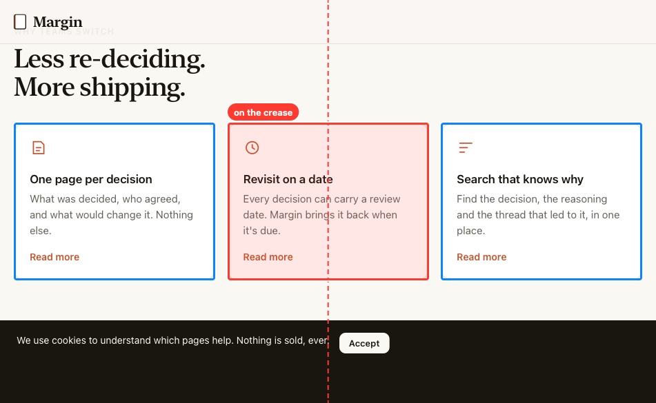
Needs you 1Changes content, links or product behaviour, or might be deliberate. Nothing happens until you answer.

Moving controls on the crease, measured where reduced motion stops them
Open · red line: the crease
15

Moving control on the crease

Needs youTo checkOpen

a "Ferro"

  • 140px wide, spans x 344–484; the crease is at x = 475.5
Your call

With reduced motion on, the customer logos stop with Ferro on the crease. Leave it, or show reduced-motion visitors a static grid of logos?

Options

For everyone else the logos stream past the crease, which Apple allows. A static grid for reduced motion is a small change, but it's a different look for those visitors.

test/edge.html:50

This control moves (a marquee or an autoplaying track), so for most visitors it only passes the fold. With reduced motion on, it stops here, on the fold.

crease-moving:a:ferro

My pick 1More than one reasonable layout. The agent picks one you can easily undo, and lists it after.

Fixed controls on the crease (open, tall; its height is estimated)
Open, tall · red line: the crease
16

Fixed control on the crease, open tall

My pickTo checkOpen, tall

button.feedback "Feedback"

  • crosses the line at y ≈ 426.5
The fix

Move the Feedback tab from halfway down to 70% down (top: 70%), so it clears the fold on Open, tall. The other option is a round button in the bottom-right corner. The fold's height on this pose is estimated, so check it in Safari.

test/edge.html:77

Open and turned tall, the fold runs across the screen. A fixed control on it stays there. The line's height is estimated.

crease-h:button-feedback:feedback

Safe fix 1One reasonable answer, a small change, holds at every width.

Viewport meta
17

viewport-fit=cover with no insets

Safe fixTo check
The fix

Drop viewport-fit=cover. The page doesn't draw under system UI and uses no safe-area insets, so it gains nothing from it.

test/edge.html:8

viewport-fit=cover lets content run under system UI, and no CSS insets it.

cover

Leave 2True but harmless or deliberate. No change; the reason is recorded.

Cut off at the edge (the page clips sideways, so it doesn't scroll)
Closed
18

Cut off at the edge

LeaveTo checkClosedClosed, wideOpenOpen, tallSplit View

div.release-strip

  • reaches x = 406, 24px past the 382 wide edge (382px wide)
  • Closed, wide: reaches x = 618, 24px past the 594 wide edge (594px wide)
  • Open: reaches x = 975, 24px past the 951 wide edge (951px wide)
  • Open, tall: reaches x = 693, 24px past the 669 wide edge (669px wide)
  • Split View: reaches x = 409, 24px past the 385 wide edge (385px wide)
Why leave it

A deliberate bleed: the release chips run off the right edge to say there's more. They're labels, not controls, and nothing scrolls.

Nothing scrolls (the page clips sideways), but this part is cut off at the right edge.

cutoff:div-release-strip

A full-screen overlay is open on load
Closed
19

Full-screen overlay on load

LeaveTo checkClosedClosed, wideOpenOpen, tallSplit View

div.grain

  • covers more than 85% of the screen at load
  • Closed, wide: covers more than 85% of the screen at load
  • Open: covers more than 85% of the screen at load
  • Open, tall: covers more than 85% of the screen at load
  • Split View: covers more than 85% of the screen at load
Why leave it

A film-grain texture over the page at 7% opacity. It ignores taps (pointer-events: none) and has nothing to close.

Something covers the screen at load. Check its close button fits on the 368px-tall screen.

overlay:div-grain

Needs you
Changes content, links or product behaviour, or might be deliberate. Nothing happens until you answer.
My pick
More than one reasonable layout. The agent picks one you can easily undo, and lists it after.
Safe fix
One reasonable answer, a small change, holds at every width.
Leave
True but harmless or deliberate. No change; the reason is recorded.
Not triaged
The agent has not sorted this yet (SKILL.md, step 3).